Monday, 10 December 2012

Our project - FUN

Just like Gilbert and George work together, we got our next project that meant we had to work in a group of 7 and create large art work. Ideas changed and developed, we got ideas from books and the internet. 
Some of our ideas were

  • stereotypes 
  • showing how old people respond to today's youth 
  • showing how time has changed 
  • fun 
Our final idea is fun, this is shown by images of objects that we find fun or that we did when we were younger, fun places and by portraits of us having fun. It was then suggested that we use a word like "us" or "me" but then it was pointed out that it may be too personal if we use words like that so we voted and "fun" is the word we're using. We're going to use 65 frames (size 6 x 4), having 13 across and 5 down. All the images will be black & white, however we're going to create the word FUN using the frames and images, these will be in red. It was then decided that each letter was going to be a different colour, "F" in red "U" in yellow and "N" in blue. 
We set deadlines for ourselves these were 

  1. Monday and Tuesday shoot the images 
  2. Tuesday afternoon and Wednesday edit
  3. Thursday print, frame and put on the wall. 
We met our deadlines and I think it looks really good and the word FUN stands out a lot. Here are some images of our work that are now up in college.


Here you can see our FUN image and the other groups image, theirs is to do with the 80's.


Sunday, 9 December 2012

Gilbert & George


England is a large, wall work consisting of thirty photographic panels mounted in abutting narrow black metal frames. The artists took photographs of a wild English rose and its leaves and coloured the photographs red and green respectively. The photograph of the rose, spread across two red panels, is central to the work. A cluster of three leaves is spread across four green panels above and below the rose. Black and white photographs of the artists standing in confrontational poses, their feet wide apart and their hands balled into fists, fill six panels on either side of the rose. They are making ‘a physical salute’ to England, one which involves ‘all the physique, not just an arm’ (quoted in The Tate Gallery 1980-82: Illustrated Catalogue of Acquisitions, p.99). Gilbert and George photographed each other against a white wall. The bottom of their legs and their feet disappear into the dark floor, which provides a kind of sculptural base for their figures. Above each black and white standing figure is a crouching, grimacing red and black figure. The image of Gilbert is placed above George and that of George above Gilbert in the compositional balancing typical to the artists’ multi-panelled photo-works of the 1970s. Gilbert, on one side, screws up his eyes and has his thumbs in his ears and his fingers sticking up above his head. George on the other side opens his eyesngland is a large, wall work consisting of thirty photographic panels mounted in abutting narrow black metal frames. The artists took photographs of a wild English rose and its leaves and coloured the photographs red and green respectively. The photograph of the rose, spread across two red panels, is central to the work. A cluster of three leaves is spread across four green panels above and below the rose. Black and white photographs of the artists standing in confrontational poses, their feet wide apart and their hands balled into fists, fill six panels on either side of the rose. They are making ‘a physical salute’ to England, one which involves ‘all the physique, not just an arm’ (quoted in The Tate Gallery 1980-82: Illustrated Catalogue of Acquisitions, p.99). Gilbert and George photographed each other against a white wall. The bottom of their legs and their feet disappear into the dark floor, which provides a kind of sculptural base for their figures. Above each black and white standing figure is a crouching, grimacing red and black figure. The image of Gilbert is placed above George and that of George above Gilbert in the compositional balancing typical to the artists’ multi-panelled photo-works of the 1970s. Gilbert, on one side, screws up his eyes and has his thumbs in his ears and his fingers sticking up above his head. George on the other side opens his eyes wide behind his glasses, sticks out his tongue and points towards his face. The artists transformed their childish gestures of mockery and rebellion into caricatured horror by lighting themselves from below and colouring the images red. Positioned above the proud patriots, the red artist-gargoyles seem to evoke their sinister alter-egos. - From the Tate website 


 In 1984 George explained:

We use colour in different ways. At first we used red and then we used red and yellow. Now we use more colours, but in each picture they mean something different. It depends on how we put them to work. They can be symbolic or they can be atmospheric or emotional. You can say red is like love, or it is like blood, or danger, or fire. It’s used in different ways, not in a simplistic way. It’s more a part of our own language, really – part of our vocabulary.


Monday, 3 December 2012

Richard Billingham

'my father raymond is a chronic alcoholic.
he doesn't like going outside, my mother elizabeth hardly drinks, 
but she does smoke a lot.
she likes pets and things that are decorative.
they married in 1970 and I was born soon after.
my younger brother jason was taken into care when he was 11,
but now he is back with ray and liz again.
recently he became a father.
'dad was some kind of mechanic, but he's always been an 
alcoholic. it has just got worse over the years. 
he gets drunk on cheap cider at the off license. 
he drinks a lot at nights now and gets up late.
originally, our family lived in a terraced house, 
but they blew all the redundancy money and, in desperation, 
sold the house. then we moved to the council tower block, 
where ray just sits in and drinks. 
that's the thing about my dad, there's no subject he's interested
in, except drink.'

'it's not my intention to shock, to offend, sensationalise, 
be political or whatever, only to make work that is as spiritually 
meaningful as I can make it - 
in all these photographs I never bothered with things like 
the negatives. some of them got marked and scratched. 
I just used the cheapest film and took them to be processed 
at the cheapest place. I was just trying to make order out of chaos.' - Richard Billingham 


 Richard's dad Ray was an alcoholic, in this image I think that this is clear, he's at the point where he can't stand and we get the feeling like he's like this a lot of the time. 

I like the expression on the faces in this image because of Rays drinking, Ray and Liz (Richard's mother) argued a lot and I like how this has been captured here.

His mother over ate and had many tattoos. 


Here again we see Ray drunk and he's like pushed the cat into the air, I think this is the best image as it has a comical feel to it. 

Family photos

 Photos of my family that I took in Home Bargains and in my cousin's house, I then edited them in Photoshop and/or adobe bridge. I think these image show a 'normal' family day life.


I like the diagonal lines that lead you to my family and also how the left side of the photo is clear and it gets lighter as the image goes showing good shallow depth of field.

 Doing a bit of Christmas shopping, in this image I like the leading lines that take you to the person ( my aunty Gillian).


I like the motion of the book in this image. 
This image shows my family setting, all sitting around watching the kids 
 In this image I like how my cousin Emma is in focus but the rest is in blur or motion. It's juxtaposition between chaos in the background and calm in the stillness of Emma.

I also made the image black and white, I think it looks better like this.


In this image Caleb had noticed the camera and started to shout, I used photoshop to edit.


I like this image because I just think its cute and natural. 


In this image there is my cousin Jon, his wife Lauren and their child Caleb, I like the similarities between mother and son, both on technology.   

Sunday, 25 November 2012

Family photographer - Jacques Lartigue

Jacques Henri Lartigue

This photo is of Jacques Henri Lartigue when he was 8 years old, he's holding a glass plate camera that was given to him by his dad. When he first started taking photos he didn't consider himself to be a serious photographer so only showed his images to friends, this was until 1963 when he was 69 years old when John Szarkowski saw his images and thought they were so good had them arranged to be shown at the museum of modern art in New York.
This is an image of his first wife Bibi, this is an 'autochrome' image. Jacques took photos in many formats, such as glass plate negatives size 2 ¼ medium format film and 35mm. Later he also experimented with the newly introduced 'autochrome' colour process. 

This is his cousin Jean on his bobsled. Many members of his family created things or tried to make new inventions. His family was wealthy so they lived a life filled with new adventures and everything they could want. 


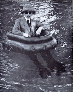
This  is his brother Zissou and one of his invention the tire boat.  I like his images because each one is something that you wouldn't be able to capture again. As Jacques started at a young age he has so many interesting photos as he documented everything that happened in his life. 
This is his friend Suzanne playing tennis, this is my favourite image as it's something that she could do as a hobby or everyday as her job. As the viewer we don't know the story so we create something ourself, I like how the image is frozen in time, she's jumping in the air trying to hit the ball back. This is something that couldn't be captured in that same way again.


Tuesday, 20 November 2012

Light trials


While doing self portraits we decided to try some light trails, to do this I set the camera to ISO 100, aperture F.11 and 30 second shutter speed. In these images to main formal elements are line and colour.  


This image didn't work out because there was too much light and I was a bit out of focus. 

This was my second attempt. 

I used photoshop to lighten the image, I think that it looks better because the line from the light stands out more. 

Sunday, 18 November 2012

Edits of self portraits


These are the original photos and then edits that I did in photoshop.

This is the original photo that was taken in the college studio

I first used the spot healing tool to remove any spots/blemishes then made the photo black and white. I then duplicated the background layer so I could make the background blue. I used the quick selection tool to select my eyes and made them the same blue as the background. I am quite pleased with this image as I like 

 Another image taken in the studio. 

I used the same technique to change the background as the last image, however I don't think it worked as well in the photo because around my head it's a bit messy looking and needs tidying up. 

Portraits

These are some of the studio self portraits of myself and around college. I edited them all using photoshop, to get these photos I used a tripod.
We tried to create 'wind' in this photo, however I don't like how it looks as I don't like the way my hair is all over my face.

So we did it again and it worked out better, I think this shows some of my personality as I am quite a smiley and giggly person. 

Even though I don't look happy in this photo I think it worked well, I like the composition of myself and the lines of the wall/window.


In these photos I used a word that I thought descried my personality. I prefer the photo on the right as I think I edited better, I like the higher contrast. I like the use of primary colours, the blue of my jumper and the writing and the red of my nail varnish.
In this image I like the simulated texture of wall I was leaning against, I think the colour of it makes the colour of my jumper stand out more. In photoshop I used the spot healing tool and added a bit of contrast.