Sunday 25 November 2012

Family photographer - Jacques Lartigue

Jacques Henri Lartigue

This photo is of Jacques Henri Lartigue when he was 8 years old, he's holding a glass plate camera that was given to him by his dad. When he first started taking photos he didn't consider himself to be a serious photographer so only showed his images to friends, this was until 1963 when he was 69 years old when John Szarkowski saw his images and thought they were so good had them arranged to be shown at the museum of modern art in New York.
This is an image of his first wife Bibi, this is an 'autochrome' image. Jacques took photos in many formats, such as glass plate negatives size 2 ¼ medium format film and 35mm. Later he also experimented with the newly introduced 'autochrome' colour process. 

This is his cousin Jean on his bobsled. Many members of his family created things or tried to make new inventions. His family was wealthy so they lived a life filled with new adventures and everything they could want. 
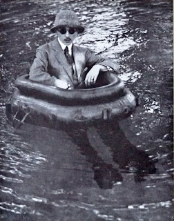

This  is his brother Zissou and one of his invention the tire boat.  I like his images because each one is something that you wouldn't be able to capture again. As Jacques started at a young age he has so many interesting photos as he documented everything that happened in his life. 
This is his friend Suzanne playing tennis, this is my favourite image as it's something that she could do as a hobby or everyday as her job. As the viewer we don't know the story so we create something ourself, I like how the image is frozen in time, she's jumping in the air trying to hit the ball back. This is something that couldn't be captured in that same way again.


Tuesday 20 November 2012

Light trials


While doing self portraits we decided to try some light trails, to do this I set the camera to ISO 100, aperture F.11 and 30 second shutter speed. In these images to main formal elements are line and colour.  


This image didn't work out because there was too much light and I was a bit out of focus. 

This was my second attempt. 

I used photoshop to lighten the image, I think that it looks better because the line from the light stands out more. 

Sunday 18 November 2012

Edits of self portraits


These are the original photos and then edits that I did in photoshop.

This is the original photo that was taken in the college studio

I first used the spot healing tool to remove any spots/blemishes then made the photo black and white. I then duplicated the background layer so I could make the background blue. I used the quick selection tool to select my eyes and made them the same blue as the background. I am quite pleased with this image as I like 

 Another image taken in the studio. 

I used the same technique to change the background as the last image, however I don't think it worked as well in the photo because around my head it's a bit messy looking and needs tidying up. 

Portraits

These are some of the studio self portraits of myself and around college. I edited them all using photoshop, to get these photos I used a tripod.
We tried to create 'wind' in this photo, however I don't like how it looks as I don't like the way my hair is all over my face.

So we did it again and it worked out better, I think this shows some of my personality as I am quite a smiley and giggly person. 

Even though I don't look happy in this photo I think it worked well, I like the composition of myself and the lines of the wall/window.


In these photos I used a word that I thought descried my personality. I prefer the photo on the right as I think I edited better, I like the higher contrast. I like the use of primary colours, the blue of my jumper and the writing and the red of my nail varnish.

In this image I like the simulated texture of wall I was leaning against, I think the colour of it makes the colour of my jumper stand out more. In photoshop I used the spot healing tool and added a bit of contrast. 

Portraits - What are they


Portraits can be a painting, drawing, photograph or sculpture of a person, a group of people or even an animal. In a portrait you are trying to show personality, emotion or social status.

Many old portraits are paintings if the people were royalty or wealthy, this was because as photography started to develop it wasn't very expensive so most people could pay for these, so the wealthy people preferred to have paintings for their portraits.

Andy warhol 

Andy Warhol
Tina Chow,
 1985
acrylic and silkscreen ink on canvas

Andy Warhol started painting portraits in the early 1960's, he painted many celebrities and famous people. He used polaroid cameras then used the silkscreen process. He also did many self portraits, he was most known for his pop art work. 


Painting Title: Self Portrait 1964
Andy Warhol


Andy Warhol 
Self-Portrait, 1986 
acrylic and silkscreen ink on linen

I like Andy Warhol's images because of the non-realistic colours and how each image is unique. 


Sunday 11 November 2012

Colour


Colour is visual perception of different wavelengths of light, we see things in colour however if you turn the lights of everything is darker so the object is perceived as being darker even though it hasn't changed colour. 

Primary colours -  Red, Blue, Yellow.
Secondary colours - Purple, Orange, Green.
Tertiary colours - Red-orange, Yellow-orange, Yellow-green, etc.

Tint - A colour plus white
Shade - A colour plus black


Warm colours are reds, oranges and yellows.
Cool colours are blues, greens and violets. 


Analogous colours - Colours that sit next to each other on the colour wheel.
Triadic colours - Colours that are equally spaced out on the colour wheel.
Complementary colours - Two colours that are opposite on the colour wheel.

Properties of colour


Hue - The name of a colour.
Value - The lightness or darkness of a colour
Intensity - The saturation of a colour, the brightness/dullness of a colour.

Here are some of my colour images.

In these image I tried to show complementary colours, orange and blue.


edited on photoshop.


As this image had no orange on I used photoshop to changed the white letters into orange letters.

 This image also shows complementary colours as red and green are opposite on the colour wheel.


Texture

Texture is the way something feels or the way we think it should feel. There are three types of texture these are actual, visual or simulated. Actual is the way a surface of an object feels, visual is the illusion of texture such as in a photograph and simulated is done by creating the look of texture such as in a painting.

Here are some examples of texture in my images.


The texture in the wall looks rough and hard.

Edited on photoshop.


This wall images has two different types of texture from the wall the harsh looking texture on the red wall and the smoother looking grey wall.

Edited on photoshop.

This photo that I took shows actual texture although it is visual texture as it is an image.

Monday 5 November 2012

Man-made objects

Man-made and organic objects

While learning about formal elements we had a project to take photos of man-made or organic objects and make up our name out of them, we then used photoshop to edit these photos.  Laura - made from man-made objects. 


The letter 'L' was made from a bench, this photo was taken from above. 
 The letter 'A' was made from a wet floor sign. 

The letter 'U' was made from a post outside the college building that I then flipped upside down.

The letter 'R' was made from the top of a building, this was taken from the top of a multi storey car park.

 The letter 'A' was made from a door frame. 

I then used photoshop to put them together. 


Sunday 4 November 2012

Shape and Mass

Formal elements - Shape, mass and form

Shape
A shape is a area in a composition that is defined by an outline. Organic shapes are shapes that have a natural look that are flowing and curving in appearance, because of this they are often called curvilinear shapes. Geometric shapes are 'man-made' shapes that have clear, sharp edges, this can show structure. Negative shapes is either the empty space or the space filled with other image/shapes whereas positive shapes is the shape/image that the view focuses on.

Mass
A form has an implied mass, it's a shape that appears to be 3-D. As the shape is 3-D this means it can be measured by height, width and depth. The depth would show the mass of a form, a form would also be contour lines. Actual mass has a measurable weight however implied mass is the illusion of weight, this could be in a painting or photograph. You can turn shapes into forms by adding depth. 


  A square becomes a cube, however with a circle you can't add another side you have to shade it for it to become a sphere.

Line

Formal Elements - Line


Line is a basic art and design element, that other elements develop from. Line can be measured in length, width and weight. They can be horizontal, vertical, diagonal or curvilinear.

Horizontal
Horizontal lines give the sense of calm and rest.

Both these images are peaceful and have a horizontal line where the sky meets land.


Vertical 
Vertical lines portray strength and height, this can be trees, people standing up or churches etc. This can sometimes be achieved by lowering the cameras position or bending down so that the camera is looking up.


Laura Rawlinson

Diagonal and curvilinear
Diagonal and curvilinear lines can suggest perspective and also create movement.

Contour line
A contour is the line that describes an edge/outline.

Construction lines
Construction lines are very directional, angular and measured.

Expressive lines
Lines that are expressive tend to show emotion, such as anger, sadness, happiness and many more.


These photos where taken in my class, we each drew a line then someone else would add to it. This would be an example of expressive lines.