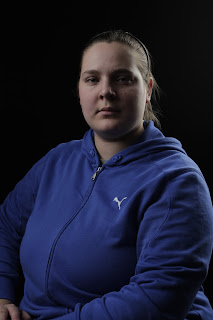

The images above are the original image on the left and on the right is the image that I took. It has the same look about it however the background is mine is all black, whereas in the original its gray. The image to the right is the diagram for the lighting.


The images above are the original image on the left and on the right is the image that I took. I really like this image as it looks moody and mysterious, if I was to do it again I would add in a gold reflector to add a glow to the skin tone. The image to the right is the diagram for the lighting.
 The images above are the original image on the left and on the right is the image that I took. This image isn't one of my best I think. I needed to make the background more white and this would make the image look more like the original and I think it'd make the dark hair stand out more. The image to the right is the diagram for the lighting.
  The images above are the original image on the left and on the right is the image that I took. I think that this could've turned out better if the light on the subject was brighter, as I think that it looks too dull/dark. The image to the right is the diagram for the lighting.
 The images above are the original image on the left and on the right is the image that I took. I really like this image, I think that the light from behind makes the viewer drawn to the face. The image to the right is the diagram for the lighting.


No comments:
Post a Comment